Still thinking of the delicious meal I had last night in Alexandria, VA at the French restaurant, Bastille. From appetizers to desserts, everything was luscious. I had a Burrata cheese and melon appetizer that was light and tasty. My nephew enjoyed the fois gras tremendously; my husband almost licked the bowl of his Caesar salad, and the next time I go there, I will definitely get the delectable shrimp and corn beignets my nephew Grey had. The bottle of Malbek was excellent as well. All in all, a very good experience and one we want to repeat!
I have found a designer I like quite a bit who I was previously unfamiliar with. His name is Skip Sroka and he is located on Wisconsin St. in Washington, D.C.
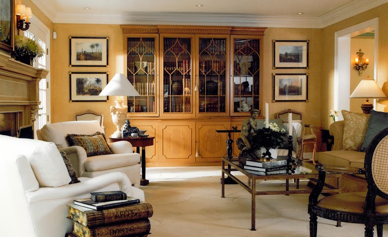
Skip Sroka's rooms are wonderful comfortable looking and luxurious without being at all stodgy. The muted room above has a great furniture arrangement and I love the sconces over the fireplace.
Above, I adore this room! I could stay here for hours reading and drinking tea, and yes, even working. Look how wonderfully comfortable the seating is. Check the lighting in the built-in alcove bookshelf.
Above, a room where the focus is on books, art, and comfort. Notice that you'd never have to search for a place to put down a drink or one that had proper lighting for a good book. I am generally not a fan of the gold color used here, but the room is so perfect that I would love it! This is the way intelligent people should live.
Books in the bathroom? I'm all for it! And behind the picture that you see on the bookcase is a small hidden television. The sconces on the mirror are perfect and so much better than overhead lighting. The towel is in easy reach and there's a chair that will come in handy for your clothes or dressing.
The small powder room, above, has a vanity with a vessel sink that manages to look traditional and contemporary all at once! Again, the sconces are great!
Best of all, Skip Sroka is not afraid of color!
My musings on daily life, philosophy, ethics, relationships, love, animals, vegetarianism, travel, and anything else that is on my mind.
Showing posts with label decorating. Show all posts
Sunday, July 13, 2014
Monday, March 03, 2014
Decorating Trends That Will Someday Make You Cringe
First, I want everyone to understand that I am 62 years old. It's important to know that I have lived in houses furnished with the trends of the 'fifties, 'sixties, 'seventies, 'eighties, and the naughts! I have seen what people cringe at years later when they remember how their houses used to be decorated. I have heard people say, "Oh, that looks so 'eighties," as though anything from that time period was anathma while at the same time they were deciding to buy a piece that my mother would have had in her house in the 'sixties! Usually these people are fairly young and I guess that haven't realized yet that everything goes in a cycle. So they will be embracing the very things and colors in 20 years that they are sneering at now.
Some of the trends I think that they will be cringing at are as follows:
Cringe Trend: Painting old furniture from the 'fifties and 'sixties in bright colors. While I applaud this trend because it reuses and recycles instead of dumping, I think this will be a future trend cringe. What will make this really dated is using very bright colors such as the yellow and the pink that you see here.
Below, you see 2 pieces that have been painted all one color. The bookshelf/desk could be from anytime in the last 30 or 40 years, but I had a dresser almost like that that I bought in 1970.
Cringe Trend: Making furniture out of old, weathered, marked-up wood without painting or refinishing it. Again, I applaud the recycling, but look at this chair with its markings on the side and the rough, dirty-looking wood and you know that someone just thinks that it is cool as hell. (I really do like the bookshelf built into it by the way). The idea is great, but the unfinished looking state is what is going to be cringe-worthy.
What really strikes me as stupid though is when someone pays an exorbitant fee for this furniture when the whole idea should be to use reclaimed materials to have something cheaper! In the room below, I see nothing that is really inherently beautiful which is why I think someone is going to cringe.
Cringe Trend: Industrial looking lights, lamps, chandeliers. Again, this is taking something that was basically never considered in the least attractive and using it as though it is.
The lamps above and below are going to be soooooo dated!
And I really don't get this one. Hmmm, we have a chandelier. Let's cover it up!
Trend Cringe: Chalkboard walls and writing on walls. Chalkboard walls just strike me as messy; as a former teacher I probably have a layer of chalkdust lining my lungs and don't see the allure although I'll bet it's fun for kids. However, having writing on your walls always has struck me as false cheer. It's probably just someone who wants to fill up a wall space but doesn't have any art.
Cringe Trend: This one is funny because in the early 'sixties so many homes had sunburst mirrors and clocks like this that when I had my own place in the 'seventies, you couldn't have paid me enough money to hang one! It will be that way again. Maybe you could say they are classic because they go in and out of fashion, but in 20 years no one is going to want this on her walls.
Cringe Trend: Ikat and huge geometric prints. Been there, done that. Think of flamestitch in the 'eighties.
Please note that I am not saying that people should get these out of their houses. Although there are a few things here that I personally don't care for at all, I'm just saying that in 20 years these decorating trends will look, well, extremely dated and many people will probably say to themselves, "What was I thinking?"!
Cringe Trend: Painting old furniture from the 'fifties and 'sixties in bright colors. While I applaud this trend because it reuses and recycles instead of dumping, I think this will be a future trend cringe. What will make this really dated is using very bright colors such as the yellow and the pink that you see here.
Below, you see 2 pieces that have been painted all one color. The bookshelf/desk could be from anytime in the last 30 or 40 years, but I had a dresser almost like that that I bought in 1970.
Cringe Trend: Making furniture out of old, weathered, marked-up wood without painting or refinishing it. Again, I applaud the recycling, but look at this chair with its markings on the side and the rough, dirty-looking wood and you know that someone just thinks that it is cool as hell. (I really do like the bookshelf built into it by the way). The idea is great, but the unfinished looking state is what is going to be cringe-worthy.
What really strikes me as stupid though is when someone pays an exorbitant fee for this furniture when the whole idea should be to use reclaimed materials to have something cheaper! In the room below, I see nothing that is really inherently beautiful which is why I think someone is going to cringe.
Cringe Trend: Industrial looking lights, lamps, chandeliers. Again, this is taking something that was basically never considered in the least attractive and using it as though it is.
The lamps above and below are going to be soooooo dated!
And I really don't get this one. Hmmm, we have a chandelier. Let's cover it up!
Trend Cringe: Chalkboard walls and writing on walls. Chalkboard walls just strike me as messy; as a former teacher I probably have a layer of chalkdust lining my lungs and don't see the allure although I'll bet it's fun for kids. However, having writing on your walls always has struck me as false cheer. It's probably just someone who wants to fill up a wall space but doesn't have any art.
Cringe Trend: This one is funny because in the early 'sixties so many homes had sunburst mirrors and clocks like this that when I had my own place in the 'seventies, you couldn't have paid me enough money to hang one! It will be that way again. Maybe you could say they are classic because they go in and out of fashion, but in 20 years no one is going to want this on her walls.
Cringe Trend: Ikat and huge geometric prints. Been there, done that. Think of flamestitch in the 'eighties.
Please note that I am not saying that people should get these out of their houses. Although there are a few things here that I personally don't care for at all, I'm just saying that in 20 years these decorating trends will look, well, extremely dated and many people will probably say to themselves, "What was I thinking?"!
Thursday, February 20, 2014
Loving Mario!
Mario loves color; you won't find all beige and white here! Not only is he not afraid to use color, he's not afraid to mix colors either. Of course, I'm a huge fan of peach and I love the peach details on the bed and curtains above. I love, love that scalloped dust ruffle!
Light and pale colors reign supreme in the pictures below.
Crystal chandeliers and sconces are an important source of light and sparkle in Mario Buatta's rooms. And he is a true lover of mirrors, using them in all shapes and sizes, and will cover walls with them.
Above, I love the mirrors on either side of the bed.
Peach walls are my favorites. I believe these are in Blair House. The mirrored sconce between the twin beds is beautiful.
Above, Mario Buatta believes in lush, sumptuous looking beds. I love the bed crown in the room above. Details like the fringe trim on the hangings make a difference in the luxuriousness of the rooms. Look at that wonderful mirrored screen to the left of the bed.
Below, another wonderful canaopied bed. The checked curtains look great with the print on the bed. Silk covers the bedside table.
More canopied beds. Above, a funkier look with the unusual bed. The wood floors are painted.
Below, a bedroom looks like an English garden - or like a room in an English country house.
I love the elements in the room above, including the curtain treatment. I had almost the same curtains for years in my family room in our Arkansas house.
Below, tell me you wouldn't fall in love with this wonderful blue and white room. That mirrored screen to the left of the bed is to die for! And I love the bit of whimsy on the end of the bed loveseat: a row of cat pillows! Buatta's bedside table are always practical; real life people can get what is needed on there: books, flowers, pens, tissues, a glass of water, lamp, etc.
Below, you may not have seen the picture ribbons for awhile, but take them down and this room is still perfect for 2014. The furniture is classic; the paintings are amusing, and the sconces, mirrors, and screen add to the luxury of the mix.
Hmmm, what would Buatta do with my townhouse, I wonder, and its less than grand proportions?!
Selected photos are from Architectural Digest.
Saturday, November 09, 2013
On My Mind: Bed Coronas and Half-Canopies
Traditional Kids by Menlo Park Architects & Designers MC3 Design Studio
I adore coronas or a half-canopy or basically anything drapery-related above a bed. But there is something that is so regal, so French, about a corona. Sometimes referred to as a "half-canopy", a corona is often a half-circle, oval, round, or curved shaped apparatus used for bed hangings above the headboard of the bed. One of the simplest coronas is in the picture, above, a simple wreath-like oval garland of metal with rods on the inside to hang the curtains. I love this sort of corona because it is simple and because the emphasis can be on the beautiful material and trims that you have. I especially favor the look where the inside is a solid color and the outside is a print or floral although the other way around is nice as well. This corona is very French to me because it is used with a sleigh bed and it's not at the top of the headboard but at the side of the bed which is placed against a wall.
Below, coronas look great with twin beds, or in this case, with twin cribs. These ornate coronas use a striped silk material with a solid interior. This corona has a pleated valance that looks quite ornate and is trimmed with thick fringe trim. Look at that wonderful chandelier! (I don't really know that I care for a dust ruffle that puddles quite that much in a child's room however).
Traditional Kids by Garden Grove Photographers V.I.Photography & Design
Above, a pretty girl's bedroom gets its feminine touch from a balloon shade style corona.
Traditional Bedroom by Miami Interior Designers & Decorators William R. Eubanks Interior Design, Inc.
Above is one of my all time favorites: this elegant design features a print on the inside of the hangings and a solid that matches the curtains on the outside. The design is very elegant with an understated edging and the more elaborate fringe trim on the curtains only.
Below, the yellow and blue combination is perfect for the bedroom since it is both sunny and soothing. The wreathed, scalloped corona here has simple hangings with an outer print that matches the curtains.
Above is one of my all time favorites: this elegant design features a print on the inside of the hangings and a solid that matches the curtains on the outside. The design is very elegant with an understated edging and the more elaborate fringe trim on the curtains only.
Below, the yellow and blue combination is perfect for the bedroom since it is both sunny and soothing. The wreathed, scalloped corona here has simple hangings with an outer print that matches the curtains.
Eclectic Bedroom by Los Angeles Interior Designers & Decorators Timothy Corrigan, Inc.
Below, half canopies look great above larger beds where a corona may be too small.
The valance part, if there is one, can be tailored to match the room whether the room's decor is modern, transitional, or traditional. The treatment immediately below is certainly not overly fussy!
Below, half canopies look great above larger beds where a corona may be too small.
The valance part, if there is one, can be tailored to match the room whether the room's decor is modern, transitional, or traditional. The treatment immediately below is certainly not overly fussy!
Traditional Bedroom by Pepperell Window Treatments The Seamstress Shop
Above, the silk is beautiful and this treatment shows that it is not necessary to have a lining for a pretty corona.
Below, one of my favorite rooms ever! The half-canopy has an elegant design; the headboard accentuates the curtains with its contrasting print, and the whole effect is lush and comfortable.
Above, the silk is beautiful and this treatment shows that it is not necessary to have a lining for a pretty corona.
Below, one of my favorite rooms ever! The half-canopy has an elegant design; the headboard accentuates the curtains with its contrasting print, and the whole effect is lush and comfortable.
Saturday, March 10, 2012
Wonderful Color!
Above, Charlotte Moss's library in a peachy tone. Charlotte Moss pictures from The New York Social Diary
I've seen so many white rooms lately that I'm reminded of my love of white in the 1970's. I even had white carpet in my living room! But even then, the white was enlivened by the presence of many, many books in wall to ceiling bookshelves. I must confess that I was afraid of color and never thought that I could do it right. But, after many years, I've come to have more confidence.
But I am mainly a lover of color because it makes me happy. I do tend to like monochromatic color schemes, maybe two colors at most. This is because we have a plethora of books and art that I cannot bear to put away out of my sight. The things that make me happy do so when I am surrounded by them. So even though we are downsizing, we still have so many things that we will keep that we may have to rotate them. But that's okay. We will keep them because we like to look at our pictures, and we like to read our books (over and over). They add the color and contrast that make us comfortable and make our home a home.
Below, I love cozy; sparse rooms are seldom cozy, and Charlotte Moss's bedroom is a classic blue and white with plenty of places to sit, place things, read, and write. I love it! Her library, above, is a wonderful mixture of homey and elegant. I can't imagine being bored in this room.
Above, look at that beautiful wall!
Above, an English country house classic combination: yellow and blue. Look at the rug!
Below, there's that gorgeous coral color again! This time the room looks quite contemporary, but still comfortable and warm. Imagine if this room were all white!
I have a feeling that in about 15 years, the burlap, stenciled pillows, and flaking furniture are going to look terribly, terribly dated. And people are going to want their interiors to be anything but white or beige.
Sunday, March 04, 2012
Bedrooms, Offices, and a Little Help
I am still working on our bedroom. I finally found a pair of lamps that I like. They are a gold leaf tole that picks up the gold of the chandy with beige oval shades that match the colour of the privacy shades we have beneath the curtains. The table on the left is actually an outdoor metal table that I had on our balcony here, but used since most of our tables are at the house in Arkansas. To the right is a malachite-topped chest in burled wood and ormolu that I like though not necessarily as a bedside table. Instead of a mirror over the bed, I put a Renoir canvas that I have had since I was in my early twenties. It is not a print but an actual canvas hand-painted by an artist (not Renoir) that is really very beautiful. It was a gift from my son's grandfather and has always been somewhere in my home wherever I've lived. I may move it, but for now, this is its home. I find that I have far more paintings, lithographs, and prints than I am going to have room for in the townhouse.
Here is a view of the larger windows in our bedroom with the curtains I am using. Unfortunately, I didn't have enough rings for them, so they are casually clipped right now, but will be put up properly when the rest of the special order rings arrive.
Below is the guest room with the curtains almost finished.
The silk undershade is too sheer, I think and needs to be lined to look really good.
I had to take this picture of a home office from one of my favorite design blogs, Stacy's Conspicuous Style. I love her style choices.
Below, Cluny helps me all the time. He thinks since I work on the computer, he is helping by taking a nap on it or lying on part of and purring loudly. I love it, even though he probably going to wreak havoc on all my files someday! Below, uncharacteristically, Cluny looks to be the aggressor although he is the pussycat, and Cuervo is the alpha cat. Cuervo helps, too, by mewing loudly, and walking up to me dragging a long ribbon in his mouth that he likes to play with. How can I refuse?
Subscribe to:
Posts (Atom)