Showing posts with label design. Show all posts

Sunday, July 13, 2014

Where I Live: Virginia and D.C. from Food to Interiors

  Still thinking of the delicious meal I had last night in Alexandria, VA at the French restaurant, Bastille.   From appetizers to desserts, everything was luscious.  I had a Burrata cheese and melon appetizer that was light and tasty.  My nephew enjoyed the fois gras tremendously; my husband almost licked the bowl of his Caesar salad, and the next time I go there, I will definitely get the delectable shrimp and corn beignets my nephew Grey had.  The bottle of Malbek was excellent as well. All in all, a very good experience and one we want to repeat!

I have found a designer I like quite a bit who I was previously unfamiliar with.  His name is Skip Sroka and he is located on Wisconsin St. in Washington, D.C.
living room decor
 Skip Sroka's rooms are wonderful comfortable looking and luxurious without being at all stodgy. The muted room above has a great furniture arrangement and I love the sconces over the fireplace.
living room decor
 Above, I adore this room!  I could stay here for hours reading and drinking tea, and yes, even working.  Look how wonderfully comfortable the seating is.  Check the lighting in the built-in alcove bookshelf.
living room decor
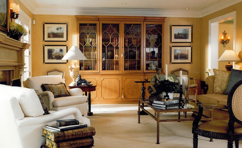
 Above, a room where the focus is on books, art, and comfort.  Notice that you'd never have to search for a place to put down a drink or one that had proper lighting for a good book.  I am generally not a fan of the gold color used here, but the room is so perfect that I would love it!  This is the way intelligent people should live.
bathroom-decor
 Books in the bathroom? I'm all for it!  And behind the picture that you see on the bookcase is a small hidden television.  The sconces on the mirror are perfect and so much better than overhead lighting.  The towel is in easy reach and there's a chair that will come in handy for your clothes or dressing.
The small powder room, above, has a vanity with a vessel sink that manages to look traditional and contemporary all at once! Again, the sconces are great!
   Best of all, Skip Sroka is not afraid of color! 

Saturday, March 10, 2012

Wonderful Color!

Photobucket
Above, Charlotte Moss's library in a peachy tone. Charlotte Moss pictures from The New York Social Diary
    I've seen so many white rooms lately that I'm reminded of my love of white in the 1970's. I even had white carpet in my living room! But even then, the white was enlivened by the presence of many, many books in wall to ceiling bookshelves. I must confess that I was afraid of color and never thought that I could do it right. But, after many years, I've come to have more confidence.
     But I am mainly a lover of color because it makes me happy. I do tend to like monochromatic color schemes, maybe two colors at most. This is because we have a plethora of books and art that I cannot bear to put away out of my sight. The things that make me happy do so when I am surrounded by them. So even though we are downsizing, we still have so many things that we will keep that we may have to rotate them. But that's okay. We will keep them because we like to look at our pictures, and we like to read our books (over and over).  They add the color and contrast that make us comfortable and make our home a home.
    Below, I love cozy; sparse rooms are seldom cozy, and Charlotte Moss's bedroom is a classic blue and white with plenty of places to sit, place things, read, and write. I love it! Her library, above, is a wonderful mixture of homey and elegant.  I can't imagine being bored in this room.
Photobucket
Photobucket Above,Charlotte Moss's living mixes tones of pinks and greens with cream and gold.  Below, another view of that wonderful library (note that no books are wrapped in white paper and there is a ladder so that you can reach the volumes higher up.  I doubt that the ladder is for show.  I love the way she adds paintings to the bookshelves in the English manner.
charlotte moss peach library, peach library
jay jeffers, beautiful coral colour
Above, look at that beautiful wall!
Photobucket
Above, an English country house classic combination: yellow and blue.  Look at the rug!
Below, there's that gorgeous coral color again!  This time the room looks quite contemporary, but still comfortable and warm.  Imagine if this room were all white!
   I have a feeling that in about 15 years, the burlap, stenciled pillows, and flaking furniture are going to look terribly, terribly dated.  And people are going to want their interiors to be anything but white or beige.
Matthew White, Coral colored walls

Sunday, March 04, 2012

Bedrooms, Offices, and a Little Help

Photobucket
I am still working on our bedroom. I finally found a pair of lamps that I like. They are a gold leaf tole that picks up the gold of the chandy with beige oval shades that match the colour of the privacy shades we have beneath the curtains.  The table on the left is actually an outdoor metal table that I had on our balcony here, but used since most of our tables are at the house in Arkansas.  To the right is a malachite-topped chest in burled wood and ormolu that I like though not necessarily as a bedside table.  Instead of a mirror over the bed, I put a Renoir canvas that I have had since I was in my early twenties.  It is not a print but an actual canvas hand-painted by an artist (not Renoir) that is really very beautiful.  It was a gift from my son's grandfather and has always been somewhere in my home wherever I've lived.  I may move it, but for now, this is its home.  I find that I have far more paintings, lithographs, and prints than I am going to have room for in the townhouse.
Photobucket
Here is a view of the larger windows in our bedroom with the curtains I am using.  Unfortunately, I didn't have enough rings for them, so they are casually clipped right now, but will be put up properly when the rest of the special order rings arrive.
Below is the guest room with the curtains almost finished.  The silk undershade is too sheer, I think and needs to be lined to look really good.Photobucket
I had to take this picture of a home office from one of my favorite design blogs, Stacy's Conspicuous Style. I love her style choices.
Below, Cluny helps me all the time. He thinks since I work on the computer, he is helping by taking a nap on it or lying on part of and purring loudly. I love it, even though he probably going to wreak havoc on all my files someday! Below, uncharacteristically, Cluny looks to be the aggressor although he is the pussycat, and Cuervo is the alpha cat. Cuervo helps, too, by mewing loudly, and walking up to me dragging a long ribbon in his mouth that he likes to play with. How can I refuse?


Tuesday, February 14, 2012

More Bedrooms and More Peach!

Photobucket
 I'm still looking at bedrooms!  Above is a favorite because of the wonderful mirrour headboard!  Horchow has a mirrored headboard that I would love to have, but I am loathe to pay over $3,000.00 for it! This mirrour is perfect because of its curve and its spotty antique look. My bedroom curtains should arrive this week and I'm hoping that they are a perfect fit! Below, I love coronas! Photobucket Photobucket
Yummy colour! I don't think I'll ever stop loving peach and coral.
Below, this looks very much like our 2nd floor stairway with the exception of the carpeting on the stairs; I've also done a picture gallery although I don't have as many pictures hung there as this. I have "picture galleries" all over my house. Photobucket Photobucket
I love this peach colour.
Photobucket
I think this is an extremely interesting curtain treatment and would work for our living room since we have the same bay window - completely rectangular - only larger. I hadn't considered having the curtains come around to the actual wall.  I have side windows, and I don't like that these are covered.
   These balloon shades will go on the stair windows on three floors. They are very simple and will be about this colour, too. These two pictures come from a decorating blog I found called Decorica.  The last post was in November, but I hope she continues the blog!  Check it out!

Photobucket

Wednesday, February 08, 2012

Home Decor: Noticing a Theme

I'm having a wonderful, albeit at times frustrating, experience decorating our new townhouse.  At my age, one knows what one likes, but unfortunately, I also carry a lot of baggage from years ago, and have to make sure that my interiors don't look too dated.  I am certainly not a slave to trends and deplore  following the latest new fad as though it's the Second Coming! However, it is good for me to remember which century I live in and make sure that small details, as long as I find them attractive or functional, keep my interiors from looking stuck in some time warp.
Having loved French and English furniture for so long and adoring the English country look, one lesson, especially since we are also downsizing is to reduce clutter: Less is More.
I love the serenity of the bedroom below - and two tones, with one of them being an off-white suits my design sensibility perfectly! New touch I should consider: adding a padded headboard - and this one is my all-time favorite!  What is already in my bedroom: similar curtains and rods with clip rings, mirrors chandelier, soft off white slipper chair to the side of the bed, different bedside tables, offwhite spread and the same bedskirt.  I am also thinking of adding a half-canopy.  I do like the one here although I'm very fond of those that curve.
Elegant Bedroom, Monotone elegant bedroom
Below, yes to the chandelier; it's smashing!  The curtains are to die for! Wonderful tailored spread and bedskirt.  Love the ornate mirror and the moldings in the room. Photobucket I believe this bedroom from 1962 is an all-time favorite of mine.  Mirror, half-canopy, padded headboard, French furniture, lovely soft colours, two-colour scheme. Of course, it's Jackie Kennedy's bedroom in the White House.
Canopy
This New Orleans bedroom is simplicity itself. I love ballon shades!
New Orleans Bedroom
Very luxe!
Pale Bedroom
Below, the ceiling treatment is wonderful! I do love colour, and this is magnificent! Ornate Ceiling
This all-white bedroom gets its colour from the outside world. Nothing competes with the view.
 Photobucket
This living room is so elegant  with its high ceilings, and drapes and wall colour the same muted colour that seems to glow.Elegant  Furnishings I love monochromatic colour schemes; the window treatment is perfect for this tall room with its smaller, slipcovered furniture.Although the wallpaper has a pattern, it blends perfectly in colour and works perfectly here.
Elegant Living Room

Monday, January 23, 2012

More on Bedrooms

I am finally back from Africa where I had a wonderful time visiting my family. We spent Christmas at a wonderful resort in Swaziland after spending some time at their home in Mozambique and touring some beautiful countryside in South Africa. We went swimming on Christmas Day; it was hot and fairly humid. I am glad to be back in a colder climate however; I don't want to miss the snow for anything! I've made New Year's Resolutions which include getting the townhouse very clean and very together!

Our guest bedroom, a work in progress. The curtains are a faux silk moire; the walls are pale yellow and the curtains have pale yellow checks. Scalamandre fringe trim in blue and yellow will go on the edges. These are simple rod-pockets from Country Curtains. I had originally planned to let them hang straight, but decided against that once that were hung. There is a shade that matches the beige in the curtains that will totally black out the room.

My bedroom is slowly coming together. Above is a gold leaf candelabra with an icon I bought on the Greek island of Patmos below it.
Below, we will have matching lamps in the bedroom and different bedside tables.  These are a stopgap until I can go "shopping" at our house in Arkansas. Oh, and the "bump" in the bed is Cluny the cat.  He loves to crawl up under the covers and nap, and I didn't have the heart to move him because he is so happy there!


The curtains here are temporary. They are not lined (although because of the shades and because I like the lamplight from outside coming into the room at night, they don't need to be)and were a great bargain at Marshall's. I decided to go ahead and hang them from the special rods I bought (they are keepers) because I was tired of bare windows with only the shades. They do provide a more relaxing ambiance and can be replaced as soon as I find my dream curtains.
A favorite painting by Eleanor Cooperman that looks perfect against the pale peachy-pink walls of the bedroom.

Sunday, December 04, 2011

Some of My Favorites!

de-rohan-chabot-french-chateau-10-summer-master-bedroom
These are some rooms that I absolutely love! If you see the previous posts, you can see where I am going with my own bedroom. And you will certainly notice the prevalence of peach and pink - colours that are beautiful in interiors (um, also in exteriors, especially in the tropics). I love the oval gold mirror over the bed.
de-rohan-chabot-french-chateau-09-summer-master-bedroom
The curtains here are especially nice, I think, with the wide banding in another fabric. I think it was Sister Parish who said that curtains should always have some sort of edging. Again, note the colours.
studio-peregalli-naples-apartment-11-master-bedroom A favorite peachy colour here.

master-bed

This bedroom's layout is very much like mine with the windows on either side of the bed. I also have large double windows to the right so my bedroom has tons of light. I already have the curtain rods to put up (like these) and I am getting cream silk curtains with edging trim.  I really like the two little tables here although we will not be replicating those since we have more tables than we know what to do with at our house in Arkansas.  I also have a chair where you see one in the picture; mine is a cream-coloured slipper chair with a bottom fringe about 4" long. My bed is bigger (a queen) and my chandelier is smaller.
Meanwhile, on the fourth floor, the picture dilemma: I brought down one of the paintings and added another Val Blackwell watercolour that I had to the right of the large center watercolour.  I think that I need to lower the center picture, too. As you can see, there is an awkward access to the attic below the bottom picture (there is another one on the other side of the room). Someday we may open this and make a rooftop patio. If you recall, this space is awkward because above the blue is a 3 foot slant before the wall actually reaches the ceiling. The second picture really shows the slanted ceiling. I also have this interesting bit of space behind the railing - this is the top of the stairs.
interior-2

interior-4th

exterior-1

The exterior of our townhouse. What is amazing is that I took this picture today.  I don't have any Christmas decorations up yet, but the geraniums are real - they are blooming like crazy even on the fourth of December.  I can hardly believe it!  They have been beautiful, and I am definitely NOT known for having a green thumb.

Tuesday, November 22, 2011

Decor and a Happy Thanksgiving


Hurrah! As always, I am really looking forward to Thanksgiving, my favorite holiday of the year.  Usually I like to cook a big dinner and have relatives over to eat, eat, eat, and drink wine.  Since I have not lived in my hometown for about 40 years, those who come usually stay with me making my house full and happy.  This year, however, we will be going to a restaurant instead of staying at home to cook.  And for once, I am glad this is so, since I have been extremely busy lately and finally I do have family living in the same area I'm in.
 Because I'm not cooking this year, I have more time to ponder the problems of decorating the townhouse. Above is our small entryway.  Two problems here:  do I change the little lantern-like light fixture and put a small chandelier there - or a different kind of lantern?
The other problem is with the sidelights - the little windows on either side of the doors. In his book, 101 Things I Hate About Your House,  decorator James Swan criticizes those who leave these windows uncovered.  However, with the different floors we have, it's not likely we will be running around the living room without clothes so that someone could see in .  I like the light they allow in during the day, and since the living room sits above street level, I think we're safe from passers-by staring in.
 Below is another problem: the square bay window.  The bay's ceiling drops down from the tall living room ceiling.  I'm not sure what to do about curtains. And once again, should I curtain the sides of the bay or leave them open.  I have some luscious coral silk I bought in Brazil that will make wonderful curtains - I'm just not sure how to style them.


Finally, above, should I put a different mirror or keep the round gold one.  I do have a French mirrour that is longer and a creme lacquer like the bed. I'm going to have to try it. I do love having the gold pick up the gold in the little chandelier though.
  Happy Thanksgiving!