Still thinking of the delicious meal I had last night in Alexandria, VA at the French restaurant, Bastille. From appetizers to desserts, everything was luscious. I had a Burrata cheese and melon appetizer that was light and tasty. My nephew enjoyed the fois gras tremendously; my husband almost licked the bowl of his Caesar salad, and the next time I go there, I will definitely get the delectable shrimp and corn beignets my nephew Grey had. The bottle of Malbek was excellent as well. All in all, a very good experience and one we want to repeat!
I have found a designer I like quite a bit who I was previously unfamiliar with. His name is Skip Sroka and he is located on Wisconsin St. in Washington, D.C.
Skip Sroka's rooms are wonderful comfortable looking and luxurious without being at all stodgy. The muted room above has a great furniture arrangement and I love the sconces over the fireplace.
Above, I adore this room! I could stay here for hours reading and drinking tea, and yes, even working. Look how wonderfully comfortable the seating is. Check the lighting in the built-in alcove bookshelf.
Above, a room where the focus is on books, art, and comfort. Notice that you'd never have to search for a place to put down a drink or one that had proper lighting for a good book. I am generally not a fan of the gold color used here, but the room is so perfect that I would love it! This is the way intelligent people should live.
Books in the bathroom? I'm all for it! And behind the picture that you see on the bookcase is a small hidden television. The sconces on the mirror are perfect and so much better than overhead lighting. The towel is in easy reach and there's a chair that will come in handy for your clothes or dressing.
The small powder room, above, has a vanity with a vessel sink that manages to look traditional and contemporary all at once! Again, the sconces are great!
Best of all, Skip Sroka is not afraid of color!
My musings on daily life, philosophy, ethics, relationships, love, animals, vegetarianism, travel, and anything else that is on my mind.
Showing posts with label interior decoration. Show all posts
Sunday, July 13, 2014
Saturday, March 15, 2014
Dreaming of Bathrooms
As the weather finally turns toward Spring, finally, I find myself wanting to change the townhouse somehow, but I find myself especially wanting to change colors and/or paint something - anything! The trouble is that I am drawn to the same colors over and over. When I started looking at bathrooms today, I found that I am drawn to 2 colors: blue and peach/coral. The only other bathrooms that don't fit in that category tend to be those that are made entirely of marble or stone.
Above, I am in love with this bathroom with its combination of gold and silver with blue, not to mention the touches of marble with bluish veining. The sconces are wonderful!
Below, this powder room is gorgeous because of that fantastic mirror!
Above, how wonderful these Portuguese tiles are! In Brazil and in Portugal, one of the most wonderful aspects of buildings and rooms are these Portuguese tiles. When my son lived in Lisbon, the three bathrooms were delightful because of the tiles (which also lined the balconies that were in front and in the back of their apartment).
Below, the mirror is perfect, the color, the style, and the blue is rich and unexpected.
Some people call the color above coral; I call it peach, and I love it.
Above and below, I think the peachy coral colors in these two bathrooms are beautiful and so cheerful!
Above, more of those delicious tiles! Blue and white is best. And I have got to get one of the extending lighted make-up mirrors for my own bath.
And below, the perfect bathroom because you really don't have to make many color decisions at all. The marble takes over and solves that decorating dilemma. The sconces are excellent.
The bathroom vignette, below, is gorgeous because of the silver and the aged mirror tiles.
The main thing about the bath is that it must be cheerful!
Above, I am in love with this bathroom with its combination of gold and silver with blue, not to mention the touches of marble with bluish veining. The sconces are wonderful!
Below, this powder room is gorgeous because of that fantastic mirror!
Above, how wonderful these Portuguese tiles are! In Brazil and in Portugal, one of the most wonderful aspects of buildings and rooms are these Portuguese tiles. When my son lived in Lisbon, the three bathrooms were delightful because of the tiles (which also lined the balconies that were in front and in the back of their apartment).
Below, the mirror is perfect, the color, the style, and the blue is rich and unexpected.
Some people call the color above coral; I call it peach, and I love it.
Above and below, I think the peachy coral colors in these two bathrooms are beautiful and so cheerful!
Above, more of those delicious tiles! Blue and white is best. And I have got to get one of the extending lighted make-up mirrors for my own bath.
And below, the perfect bathroom because you really don't have to make many color decisions at all. The marble takes over and solves that decorating dilemma. The sconces are excellent.
The main thing about the bath is that it must be cheerful!
Sunday, February 23, 2014
The Special Beauty of Blue and White
I adore blue and white in decorating schemes. It's fresh, classic, and usually very easy for the non-decorator to pull off! Blue and white is especially soothing for bedrooms, and probably one of the most classic uses of blue and white is with toile. The bedroom above is a wonderful oasis of calm in a busy world.
I am a die-hard fan of peach and coral. Blue and a creamy white with peach or coral is beautiful! And if you are using blue and white porcelain, it really pops against a peach or coral background.
Another great thing about decorating with blue and white is that apartment dwellers who cannot change the color of those white or cream walls can still have what looks like a planned and cohesive design. All you have to do is paint some furniture a dark grey-blue or white (or mix both!) and buy ready-made curtains and bedspreads. For the living room, solid white or blue slipcovers will work although printed blue and white ones look really special.
All shades and tones of blue look good with white, cream, off-white or ivory. Look how crisp the room below is!
I love the curtain treatment below with the inner lining blue and pretty white fringe trim.
Below is another example of what could be done if you are living in an apartment and cannot paint the cream walls. Use blue and white material to cover chairs, sofa, and window, and no one will know that you didn't plan to have cream walls all along!
I adore blue and white porcelain grouped together. Even the lamps are blue and white. And blue and white porcelain works so seamlessly with your decor that you can still add a gallery wall.
What a peaceful sitting room!
Decorating with blue and white can be cost effective, too. Blue and white porcelain jars and plates can be found in Chinatown and sometimes even at dollar stores. Simple muslin curtains in a creamy white or blue can be found for a few dollars a yard.
Above, blue and white porcelain looks wonderful against almost any color. Here it's lovely against a warm grey.
Blue and white is marvelous for a kitchen!
Above, yellow is amazing as a background for blue and white. Below, note that there is no solid blue in the room; even the curtains are striped. but the overall effect sends a blue message.
Thursday, February 20, 2014
Loving Mario!
Mario loves color; you won't find all beige and white here! Not only is he not afraid to use color, he's not afraid to mix colors either. Of course, I'm a huge fan of peach and I love the peach details on the bed and curtains above. I love, love that scalloped dust ruffle!
Light and pale colors reign supreme in the pictures below.
Crystal chandeliers and sconces are an important source of light and sparkle in Mario Buatta's rooms. And he is a true lover of mirrors, using them in all shapes and sizes, and will cover walls with them.
Above, I love the mirrors on either side of the bed.
Peach walls are my favorites. I believe these are in Blair House. The mirrored sconce between the twin beds is beautiful.
Above, Mario Buatta believes in lush, sumptuous looking beds. I love the bed crown in the room above. Details like the fringe trim on the hangings make a difference in the luxuriousness of the rooms. Look at that wonderful mirrored screen to the left of the bed.
Below, another wonderful canaopied bed. The checked curtains look great with the print on the bed. Silk covers the bedside table.
More canopied beds. Above, a funkier look with the unusual bed. The wood floors are painted.
Below, a bedroom looks like an English garden - or like a room in an English country house.
I love the elements in the room above, including the curtain treatment. I had almost the same curtains for years in my family room in our Arkansas house.
Below, tell me you wouldn't fall in love with this wonderful blue and white room. That mirrored screen to the left of the bed is to die for! And I love the bit of whimsy on the end of the bed loveseat: a row of cat pillows! Buatta's bedside table are always practical; real life people can get what is needed on there: books, flowers, pens, tissues, a glass of water, lamp, etc.
Below, you may not have seen the picture ribbons for awhile, but take them down and this room is still perfect for 2014. The furniture is classic; the paintings are amusing, and the sconces, mirrors, and screen add to the luxury of the mix.
Hmmm, what would Buatta do with my townhouse, I wonder, and its less than grand proportions?!
Selected photos are from Architectural Digest.
Monday, May 14, 2012
The Townhouse: Working on the Living Room
Above are the flowers my kitties (yes, kitties, not kiddies) got me for Mother's Day! They were a wonderfully pleasant surprise on Saturday morning. Those thoughtful cats,Cluny and Cuervo, included a box of chocolates with the flowers. Needless to say, the flowers are still here, but the chocolates are gone!
Now I've been working on the living room. Our grand piano is in Arkansas so anything I do now will be temporary since we will probably have to put it in the living room eventually. In our family, while we do buy furniture, we are also very conscious of keeping pieces that have been in our families. The living room is proof of that. Most of the living room furniture that is in the townhouse came from my mother's-in-law house. The sofa was in her formal living room as was the rug, the coffee table that you see here, and the two chairs that are upholstered in the same lampas fabric. The French chair to the left is one we bought some time ago; the ottoman that goes with it is under the table so that it will be out of the way. The pretty table that sits in the bay window was also in my in-law's house behind the white sofa that you see here. It opens and one of the four legs swings back to make it into a square table. Although I hadn't used it that way before, I decided that it would look better in the bay if it were open. Sitting on it are figures of saints, a wooden angel, and another tin retablo, this one of St. Michael, who is the patron saint of lawyers.

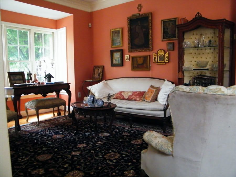
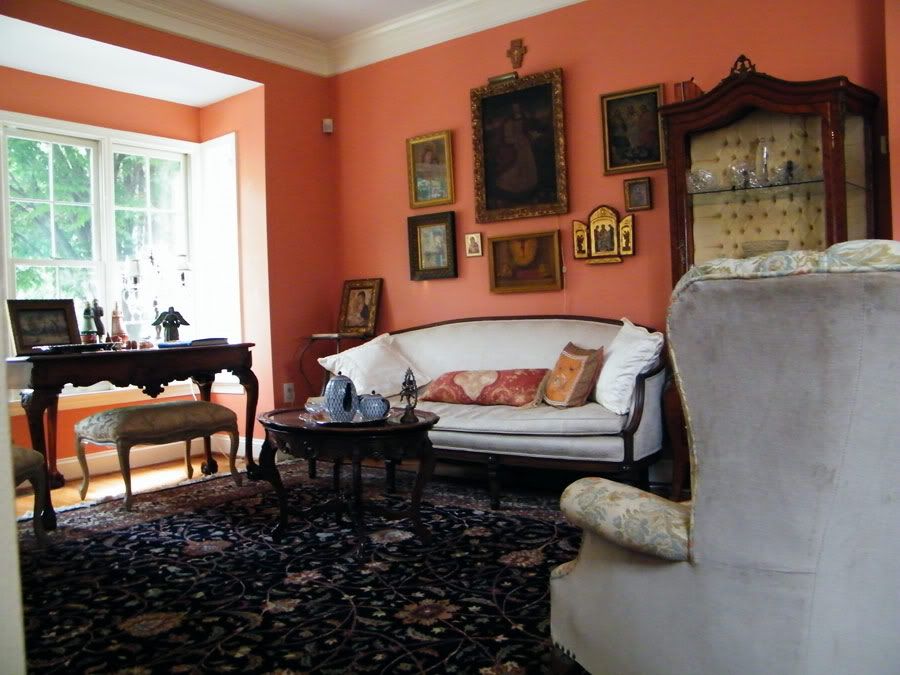
I love the coral colour of the walls, and chose it especially to go with my collection of icons and religious paintings. The largest painting on the wall is of St. Barbara; I found it in Brazil and my husband bought it for me for my birthday. To the left is a tin retablo (framed for protection) of the Madonna and child, one of the first retablos I ever bought, from Mesilla, New Mexico. The other icons were gifts (the one with open wings from my son and daughter-in-law when they were living in Portugal) or I bought them while travelling in Greece, Mexico, and India as well as other countries (I have figures upstairs of the Holy Family that are African - gifts from my son and daughter-in-law). The coral colour is a perfect foil for the paintings and icons since some of them are rather dark.

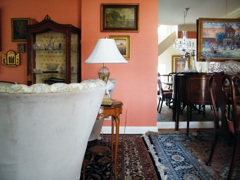
I also collect landscapes; here are three on a small wall separating the living room and formal dining area. We also have a collection of cut glass.


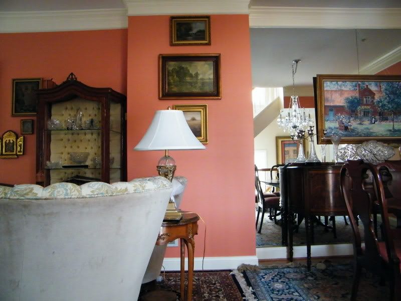
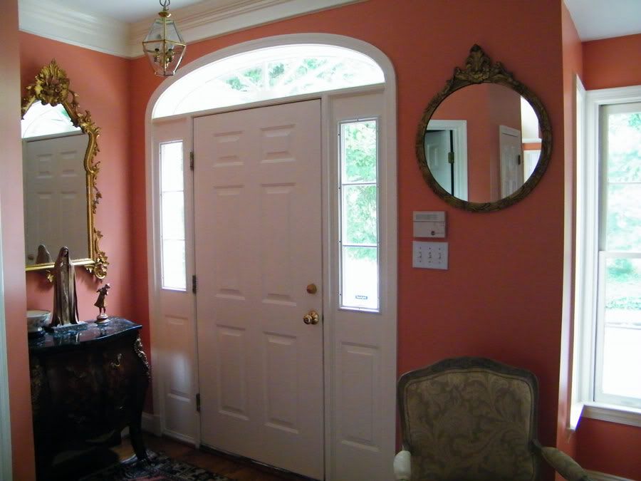
The small entryway is basically part of the living room (ah, downsizing), but there is still a place for a chest and a large mirror so that I can check my face before going out or before someone comes in. There is also a small powder room to the left (you can barely see the white door frame). On the chest is a small metal sculpture and a large gold leafed figure of the Madonna that is quite beautiful. I've meant to replace the light fixture here with a different type of lantern or a small chandelier. However, not being bothered by bright brass, I rather like the way the bright gold of the lantern enhances the gold leaf of the nice mirror (this mirror from my in-law's French guest-room; the chest is ours). The mirror to the right is rather high, necessary because it has to be above the electricals and because I want it to reflect the crystal chandelier.
I decorate slowly over time, so I will have to live with this arrangement to see if it works. We still have cut glass, paintings, and sculpture that is currently in our house, so everything will eventually change a bit. While I have tons of framed photos of family, I tend not to put those in the formal rooms.
If you have any ideas, please be sure to share!
Subscribe to:
Posts (Atom)